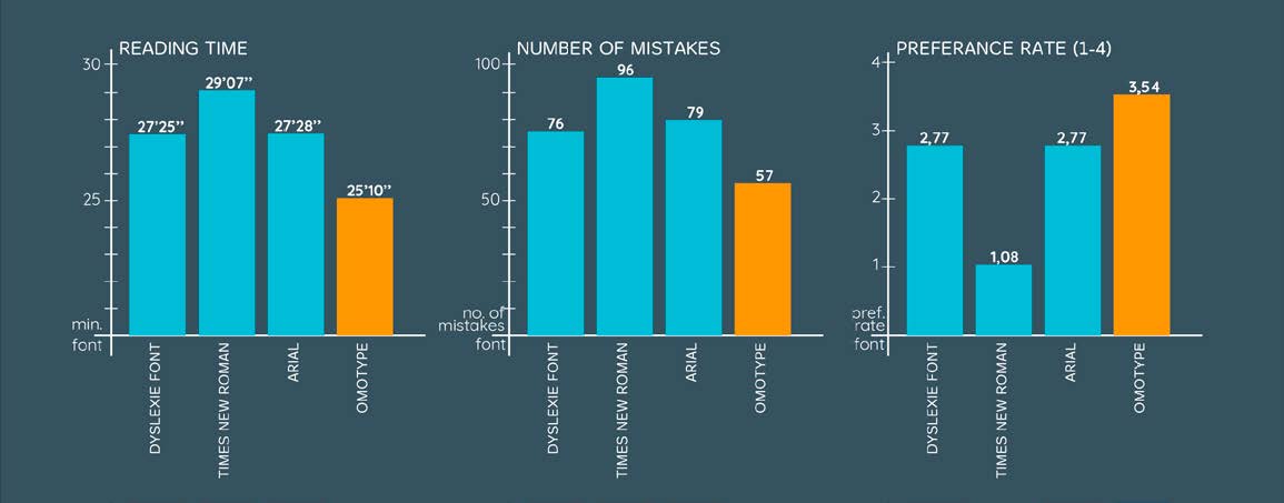


During the development of the OmoType font, two studies were conducted - a comparative study and a study with an eye-tracking device. Texts written in OmoType are more legible to children with reading difficulties. They read them faster with less mistakes. These results indicate a better understanding of the text and a more enjoyable reading experience.
Shorter lines of text on mobile devices improves reading speed in dyslexics. Also, the possibility of individual text configuration aids in reading.
Using warm background colors (like peach, orange, and yellow) have an impact on readability on screen for people with and without dyslexia.
Manipulation with a letter and line spacing in text help dyslexics to read faster with fewer errors and enhances reading comprehension.
Font types have a significant impact on reading performance for dyslexics. Careful selection of the font helps with the readability of the text.
Recent research shows that settings that make reading easier for dyslexics make it easier for all readers.
Some dyslexics have problems with letters with the same shapes but different orientations. For some, this problem persists into adulthood.
An empowering aid that minimizes stigmatization, increases self-confidence, motivation for reading, and promotes independence.